Esports Charts Dashboard Update: Executive View & Business UI
Data has been a backbone of esports decisionmaking, but not always accessible. With the introduction of our Performance Breakout update, as part of our Executive View & Business rollout, Esports Charts is reshaping how users interact with our advanced tournament analytics.
This update isn’t about adding new metrics, but making the existing data accessible and actionable in seconds, particularly for those who are looking for a quicker overview than that offered by spreadsheets or raw data.
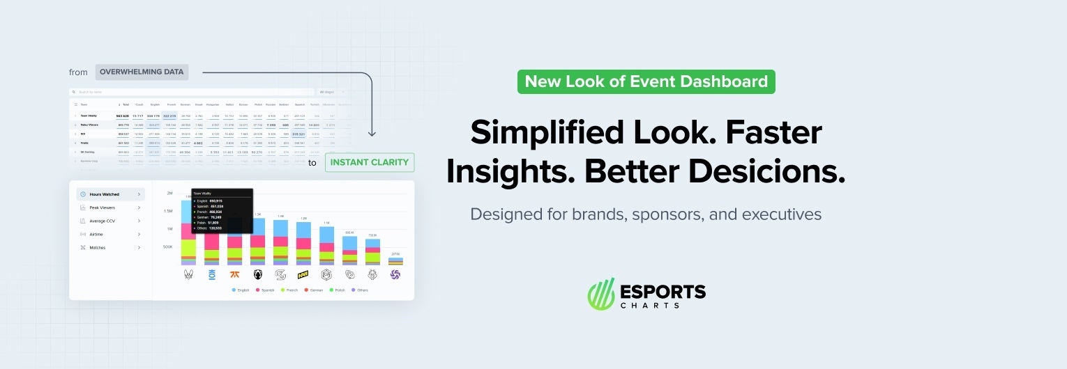
From overwhelming data to instant clarity: what is Performance Breakdown?
Esports analytics platforms have too long catered to data specialists. While comprehensive, the data required effort to extract actionable insights and created a real usability gap, particularly for non-technical users such as brand managers, sponsors, or executives. Our new visual overhaul of our analytical tournament dashboards simplifies readability, making our dashboard an intuitive tool for all esports staff.
Instead of navigating dense, Excel-style tables, users are now presented with:
- Aggregated performance metrics
- Visual anchors and trend indicators
- Clear hierarchy of information

This transformation reduces time-to-insight from minutes to seconds, enabling our users to immediately understand tournament performance dynamics, team and brand visibility, and platform- and language-level reach and contribution. Metrics are also no longer isolated, but instead paired with trend indicators to better understand results at a glance.
Speaking the language of business
One of the most significant shifts introduced by our new Executive View & Business UI rollout is a move toward business-centric metrics and language.
Instead of working with complex viewership metrics, users can now access aggregated totals, view trends at a glance, and quickly grab necessary insights such as ROI or Share of Voice — rather than being something a user has to calculate or infer. This updated dashboard aligns more closely with the expectations of marketing departments and sponsorship managers, who wish to evaluate whether their investment translated into meaningful exposure without building a separate analysis.
A core design principle behind our new look is what can be described as the “3-second rule”. Upon opening a dashboard, users should immediately find out if the tournament is growing or declining, what teams or brands dominated attention throughout the event, and which platforms drove viewership. With our new visual hierarchy and improved visual cues, users can find whatever they need in a drop of a hat.


Explore what's changed with our new Dashboard UI update
Our new look also features clean, automatically-generated graphics which can fit directly into reports and presentations and are more optimized for media use. Our demos and tutorial system ensures decision-makers immediately grasp the value of esports and must not rely on lengthy walkthroughs.
For the organisations operating in esports as sponsors or partners, this distinction matters enormously. The question they are asking is rarely "what was the peak viewership?" It is "did our brand win?" The updated dashboard is designed to answer that directly.
A unified workspace for teams: what this means for users
Another critical advantage of the update is its ability to serve multiple roles within the same organization. Analysts still retain full access to the platform's depth — every filter, every granular metric, every export option they relied on before — but it is now more accessible than ever before.
For brand managers and sponsors, the dashboard presents the media weight of any participant or channel in a format that is immediately comparable and actionable. This allows a faster evaluation of campaign outcomes and promotes independence for decision-makers.
For esports organisation CEOs and tournament operators, evaluating a tournament opportunity no longer requires a briefing from an analyst, enabling more regular check-ins rather than occasional deep dives. The interface no longer demands effort to extract insights and value, with understandings of performance available within seconds.
And for the analysts, the update makes their work easier rather than displacing it. Building reports for stakeholders, extracting visuals for presentations, and demonstrating value to management all become faster and cleaner.
This effectively turns Esports Charts into a shared operational layer across departments, rather than an analytical tool.
The introduction of Performance Breakdown marks a clear evolution in how esports data is delivered and consumed. For organizations operating in esports—whether as teams, sponsors, or tournament operators—this means one thing: faster, more confident decision-making powered by data.

Detailed Esports data at your fingertips.
Subscribe to & start exploring!


