Esports Charts Team Dashboard: A deeper look through the lens of RRQ
For esports organizations, winning matches is only part of the battle. The other half is understanding where attention comes from, how it shifts, and how to use it. A single game can be broadcast across ten platforms in as many languages, yet many teams and esports clubs still struggle to answer fundamental questions:
-
Which regions are actually driving our audience growth?
-
When do we hit peak visibility, and why?
-
Which rosters deliver real returns, and which quietly underperform?
-
Are we getting our fair share of exposure in tournaments?
Without clarity, opportunities slip away: in sponsorship talks, in negotiations with organizers and in strategic roster planning.
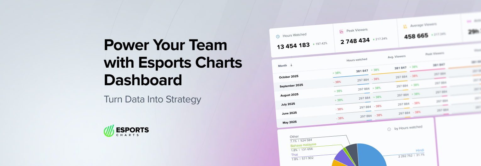
The Esports Charts Team Dashboard solves this problem by turning scattered viewership data into a single, actionable source of truth. With filters for timeframes, games, languages, and platforms, teams can track performance at every level: from one match to a full season. They can see how viewership splits across Twitch, YouTube, or TikTok, measure how much attention their rosters bring to tournaments, and benchmark themselves against competitors.
The value isn’t just in cleaner charts, it’s in smarter decisions. The dashboard empowers organizations to identify untapped markets, spotlight peak moments, optimize game portfolios, and negotiate from a position of strength. In the following sections, we look at Rex Regum Qeon’s performance through this lens, to show how data becomes strategy.
Identifying peak moments
Every team has defining matches that attract extraordinary attention, but without proper tracking, it’s hard to know how big those moments really are, or what makes them possible. The Overall tab in the Team Dashboard gives that clarity by consolidating total Hours Watched, Peak Viewers, and Average Viewers over time.
Before committing, you can explore the platform yourself with a demo version of our Team Dashboard. This access lets you test its full functionality, see how the analytics work in practice, and understand how it can support your needs. To get started, simply log in and request demo access via our pricing page. If you encounter any issues, reach out to us at [email protected] and we’ll set you up right away.
For RRQ, 2024 highlighted both growth and slowdown. The organization reached a record 189.4M Hours Watched, yet the year-on-year growth rate dipped to +15%, compared to +46% in 2022 and +32% in 2023. The dashboard makes it clear why: Air Time dropped by 25% versus 2023, which limited overall watch time despite strong engagement. Average Viewers actually climbed by +39.6%, showing that RRQ’s audience was more loyal and concentrated even as broadcast hours shrank.

The tool also makes it easy to spot standout peaks. In June 2025, RRQ recorded 26.9M Hours Watched and 4.1M Peak Viewers — the second-highest peak in team history, only behind January 2023. It also ranked as the #3 month ever by Average Viewers. Such records aren’t hidden in raw data; they’re surfaced instantly in the dashboard.
The ability to filter by time period or exclude specific genres adds further depth. When removing battle royale titles, RRQ’s Q2 2025 becomes the most successful quarter in its history with 59.7M Hours Watched. This kind of context allows organizations to identify when peaks are tied to roster shifts, tournament formats, or even seasonal audience behavior, turning “spikes” into patterns that can be replicated.
Mapping and expanding audience geography
For any organization, it’s not enough to know how many people are watching, understanding where and how they’re watching is just as important. The Team Dashboard allows RRQ to break down audiences by language, platform, and individual matches, giving a complete picture of reach across regions and channels.
Match-level insights
In June 2025, RRQ’s most-watched game was ONIC vs RRQ.H (MPL Indonesia Season 15), generating 10.3M Hours Watched, of which 9.3M came from Indonesian-language broadcasts. At the same time, Valorant showed a very different profile. The RRQ vs Fnatic match at VALORANT Masters Toronto delivered 565K Hours Watched in English, becoming the #1 match across 10+ languages, including Turkish, Thai, Spanish, and Polish.

This match-level split highlights how RRQ’s brand travels differently depending on the title: MLBB dominance is regional and language-specific, while Valorant creates a more globally distributed audience.
Language distribution
The dashboard confirms RRQ’s overwhelming home base: in June, Indonesian accounted for 82% of Hours Watched (22.1M HW). Only English (7.8%) and Burmese (2%) crossed the 2% mark. Yet month-to-month shifts reveal where secondary audiences are growing. Polish viewership jumped +1468%, while Bahasa Malaysia rose +575%, proving the value of tracking smaller but fast-rising markets.
Check your team’s subscription pricing on the Team Dashboard!
Meanwhile, Vietnamese viewership collapsed -80% month-over-month, dropping from #2 in May to #6 in June, an early warning that might otherwise go unnoticed.
Platform breakdown
The dashboard also shows where fans tune in. YouTube led with 61.8% of HW, followed by TikTok (31.5%) and Twitch (4.1%) — all surpassing 1M HW. For MLBB, TikTok and YouTube were the clear leaders, while in Valorant, the split flipped: Twitch dominated with 1.1M HW (50%), followed by YouTube (44%) and TikTok trailing at just 2%.
Evaluating the game portfolio
For multi-title organizations like RRQ, knowing which rosters truly carry the brand (and which quietly underperform) is essential. The Team Dashboard consolidates performance across all games, allowing teams to see which titles drive audience growth, which sustain niche but loyal followings, and where adjustments may be needed.
Game-level performance
In June 2025, MLBB dominated with 87.7% of RRQ’s total Hours Watched, up from 71% in May. Watch time for the title jumped +71% month-over-month, while Air Time remained similar to PUBG Mobile, which, despite comparable exposure, generated only 4.1% HW. This contrast makes clear where the audience is concentrated.
By comparison, Valorant’s share fell to 8.1%, nearly half of its May level (15.8%), with HW down 29% month-over-month. For an organization, this signals a potential need to reassess investment or find ways to reignite interest.

Roster-level insights
The Dashboard also makes it possible to evaluate individual teams. In June, RRQ fielded a single roster per title, so results mirrored the game-level breakdown. But looking at May, when multiple MLBB rosters competed, differences become visible.
-
RRQ Hoshi (MLBB) was the clear leader across all metrics. Even with a decline in Hours Watched (-7%) and Peak Viewers (-28%), its Average Viewers still grew by 9%, showing stronger engagement from its core fanbase.
-
RRQ Kaito (MLBB) recorded a 34% drop in Peak Viewers, yet its Average Viewers grew by 23%, nearly doubling those of the HoK roster (14.3K vs 7.5K). Despite ranking lower in overall HW, Kaito proved more efficient in keeping its audience engaged.
-
Other divisions, like Valorant and Free Fire, both crossed the 1M+ and 2M+ HW thresholds in May, demonstrating value outside of MLBB, though on a smaller scale.
Strategic implications
This level of detail helps RRQ (or any organization) decide where to double down, where to maintain presence for sponsorship reasons and where to reconsider roster commitments. It reveals not just the flagship titles but also which “secondary” teams quietly deliver strong engagement.
Measuring tournament impact
Tournament placement tells only part of the story. The real question for organizations is: how much attention did we bring to the event itself? The Team Dashboard makes this measurable by showing a team’s exact share of Hours Watched, Air Time, and Peak Viewers within each competition.
Contribution to major events
In June 2025, RRQ’s biggest impact came at MPL Indonesia Season 15 (MLBB), where the team generated 23.6M Hours Watched, accounting for 71.4% of the tournament’s total HW. This is a remarkable share, given that RRQ’s Air Time was only 42.7%, meaning their games delivered outsized value compared to the minutes played.
By contrast, at VALORANT Masters Toronto 2025, RRQ contributed 6.3% of tournament HW with 7.5% Air Time, a smaller role and lower efficiency. The ability to compare across events highlights where RRQ acts as a driver of viewership versus where it plays a supporting role.

Peak moments within tournaments
The dashboard also makes it easy to pinpoint matches that shaped the tournament’s audience curve. RRQ’s MLBB matches were dominant overall, but in Valorant, their series against Fnatic stood out: 565K Hours Watched in English alone, ranking as the #1 match across more than ten languages.
Meanwhile, in MLBB, the ONIC vs RRQ.H showdown reached 10.3M HW, almost entirely fueled by Indonesian-language coverage (9.3M), confirming RRQ’s unrivaled domestic pull.
Why it matters
For teams, this isn’t just reporting, it’s leverage. By showing exactly what percentage of tournament audiences they attract, organizations can argue for prime scheduling, more spotlight in broadcasts, and stronger sponsor positioning. A claim like “we draw big numbers” becomes “we delivered over 70% of the tournament’s Hours Watched with less than half of the Air Time”.
Competitive context
Esports doesn’t happen in isolation. A team’s numbers may look impressive on their own, but the real picture only comes into focus when measured against competitors. The Team Dashboard’s benchmarking features allow organizations to compare themselves directly to rivals across titles, tournaments, and regions.
For RRQ, MLBB is the flagship title, and the numbers confirm it. In June 2025, RRQ Hoshi consistently outperformed most peers, helping the organization secure some of the highest Peaks and Hours Watched in the game. Yet the Dashboard also shows where the balance shifts. In PUBG Mobile, rivals like Bigetron by Vitality and Alter Ego Ares often edge ahead, while in Free Fire, EVOS remains a powerhouse competitor.
This context matters: a roster that looks strong in absolute terms may still be mid-tier relative to the top of its ecosystem.
With this clarity, RRQ can decide where to reinforce dominance and where to invest in closing the gap. For sponsors, it also reframes the conversation: is this team a market leader in a title, or a challenger brand in need of support? By combining internal stats with external benchmarks, the dashboard shifts analysis from self-perception to market position: a far more actionable perspective.
Esports performance is never just about raw numbers, it’s about context. By combining internal data with market-wide benchmarks, the Team Dashboard shows not just how strong a roster looks in isolation, but how it stacks up against real competitors across titles, tournaments, and regions. This perspective helps organizations refine strategy, sponsors gauge true market position, and teams focus resources where they matter most.
You can try it for yourself right now: simply log in and request demo access via our pricing page. If you run into any issues, our team will be happy to help, just contact us at [email protected] to get set up.

Detailed Esports data at your fingertips.
Subscribe to & start exploring!


